Tonester Paints, a sexy new paint company with colors and ideas that emphasize sensuality and contemporary culture, caught our eye online. Founder and CEO Tony Piloseno sat down with TABLE Editor-in-Chief Keith Recker for an interview.
A Q&A with Tonester Paints Founder and CEO Tony Piloseno
Keith Recker, TABLE Magazine: Can you walk me through your creative process for developing a new Tonester Paints color?
Tony Piloseno, Tonester Paints: Being in the retail paint industry since I was 18, I gained technical knowledge and hands-on experience in creating the paint colors people use in their homes. When I launched Tonester in 2022, I developed my own style of formulation, one that reflects the colors I’m naturally drawn to. I’ve always loved deep, moody shades with a lot of dimension and personality.
I only create a new color when I’m genuinely inspired. That inspiration tends to come from unexpected places. Travel, music, art, fashion, or even brands and products that align with my taste values. I usually avoid chasing trends. My belief is that if something is already being widely talked about, we’ve either already made it or it’s too late to make it authentically.
KR: What personal experiences or perceived opportunities in the marketplace led you to start Tonester Paints instead of joining an existing paint brand?
I’ve always considered myself a creative person, especially when it comes to how I like to market products. Working at my local paint stores from ages 18 to 22, I realized how exciting the paint industry really was. We offered products that genuinely transformed people’s spaces and the way they lived. Every type of customer walked through the door. First-time homeowners, seasoned painters, designers, contractors, all coming in with the same goal of making their space feel right. Almost everyone, at some point in their life, ends up shopping for paint.
I chose to start Tonester because no company in the industry was offering anything with real edge, creativity, or personality. There was no bold point of view. Nothing that felt fun, fresh, or culturally relevant. Getting fired for making TikToks to market paint only pushed me further to carve out my own path, to celebrate creativity instead of suppressing it.
KR: Which colors or collections have turned out to be your most popular? Have you had any color surprise you by becoming popular?
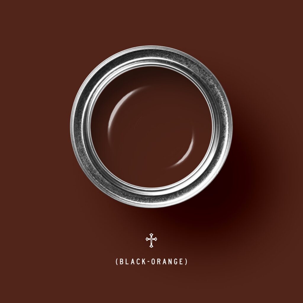
TP: The color that has unexpectedly become a staple of the Tonester brand is ♱ (Black-Orange). When I first released it on TikTok and Instagram, I wasn’t sure it would be perceived as tasteful or practical enough to work in most people’s homes.
♱ (Black-Orange) is also the first color on the market to be solely by a symbol rather than a traditional name. I intentionally chose the gothic cross symbol to challenge convention. It has become one of our most distinctive and recognizable colors.
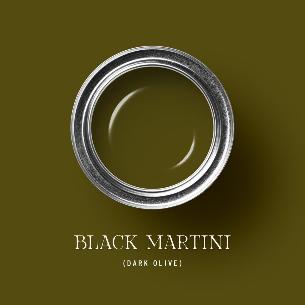
KR: My favorite so far is Black Martini. Any good anecdotes about that one?
TP: Yes! Black Martini’s creation is thanks to a trip to Lake Como last summer. There were more than enough dirty martinis enjoyed with friends and associates during the trip, and when I returned to Florida, that experience translated directly into the creative process. I started with a vibrant olive-yellow base and then introduced black into the formula—something I do with all of our colors. The result was a bold yet tasteful olive tone that makes an almost vintage
statement within a space.
KR: How do online trends (like TikTok, Instagram, and Pinterest) influence consumer taste for color? How do they influence you?
TP: I believe online trends driven by social media platforms have a significant impact on consumer demand. As new creators and designers emerge and showcase their creativity, consumers have become less hesitant
to use bold, impactful colors.
I worked at local paint stores during the “Millennial Gray”
era, a time when social media had not evolved into what it is today. Designers and creators are now able to demonstrate online how to incorporate more unique and expressive colors into homes in tasteful, approachable ways.
KR: Looking ahead to 2026, what shifts do you expect to see in interior color—are we moving toward bolder statements, softer neutrals, or something completely different?
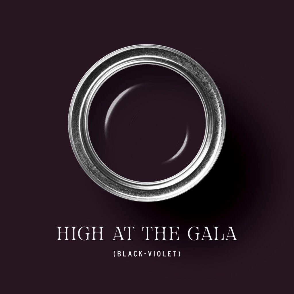
TP: Looking ahead to 2026, I expect to see a continued shift toward bolder yet warmer colors in interior spaces. We’ve seen a noticeable change in both client and retail demand toward darker, warmer tones such as ♱ (Black-Orange), High at the Gala, and Black Martini. These shades still provide depth and drama, but they also bring a sense of warmth, nostalgia, and comfort to a space. These warmer, statement-driven colors will make a lasting impact on the design world as we move through 2026.
Story and Styling by Keith Recker
Featured Photography by Dave Bryce
Custom Spoons by Kevin Recker
Paint Swatches Courtesy of Tonester Paints
Subscribe to TABLE Magazine‘s print edition.