Abbey Cook, US Trend Editor for forecasting service TrendBible discusses the 2026 Color of the Year choices from six big companies.
Why Does the Color of the Year Matter?
There is always anticipation around what paint companies and trend agencies will dub “the color” for the following year. The decisions should capture the current zeitgeist and overall energy of what’s to come as we step over the line of December 31 in any given year. The choices often hit the nail on the head but occasionally there are others that leave you disappointed.
For a trend forecaster, sometimes they even leave us insulted. I’m talking about the wildly controversial white that is Pantone’s 2026 pick. Cloud Dancer, much like the political polarization gripping our nation, felt uncomfortable. Industry insiders interpreted the third lackluster choice in a row (following 2024’s Peach Fuzz and 2025’s Mocha Mousse) as a sign that Pantone has given up on tapping into the zeitgeist and is focusing instead on AI-researched notions of statistical prominence…which means that the Color of the Year will forever teeter back and forth between variations in the neutral zone. Safe neutrals always win the numbers game, but they do not even make the playoffs when it comes to expressing the spirit of the times or inspiring creatives to tackle the challenges of the day.
White has many facets – serenity, a blank slate to start over, a peaceful dove, but it also symbolizes a weak, “offend no one” neutrality or, worse yet, a sign of surrender. As someone who works in color, I feel now more than ever the need to make our messages heard and to take a stance. Color is more than just applying something to the surface of a product. When times are challenging, color has a critical role that, when used correctly, makes an impact on culture. It’s political, it’s social, it’s emotional: we need to make a scene with it. It needs to help move us forward.
How Trend Forecasting Plays Into Our Lives
In my work as a trend forecaster, I have been vocal about coloring 2026, inside and outside the lines, in a radiant, bright plum. The purple spectrum represents unity, and most importantly, it energizes us to make change. It’s a balanced color as it dances between feisty red and calming but confident blue. More poignantly, it calls for both political parties to come together. This jeweled red violet has been on the fashion runways for a couple years, which is a signal it will make its way into the home. The fashion world has embraced purple broadly in many catwalk presentations for Autumn-Winter 2026-27. Purple is set to become the new statement in everyone’s wardrobe in 2026, and in homes now, as well as heading into 2027.
Purple aside, this year there is a tale of two different color stories in home-oriented design circles. One path offers a constructive helping hand with safe neutrals. Another reaches for nature’s profound sense of knowledge with a bouquet of greens (also a popular pick among many fashion trend forecasters). There is one pink in the mix, a rebel with a cause who is rooted in nostalgia with a side of punk, giving pink one last stand before purple takes over.
What Color Can Do For Us
Color is everywhere, flooding our social media and digital outlets and yet—especially in the Western culture of recent decades—we shy away from it in our homes and wardrobes. Change can be slow and hard, but bit by bit we (re)learn that color is our friend when used in ways that makes us feel alive. Start small. Indulge in courageous yet contained acts of daring color on a pillow or mug and see how you feel after hanging out with it. Continue to add signs of a colorful life to your personal world. Then be bold with it and step outside: be seen, make noise, and “be the change you want to see,” starting with color.
Color is powerful and creates change, not just in our homes, but all around. It should be noted these colors aren’t randomly plucked from a hat. A great amount of research and thought goes into choosing why companies see these individual colors as important in the year to come. Art, fashion, climate change, politics, restaurants, social media, and just about everything you see and touch, are studied by trend forecasters and color strategists, helping to determine the mindset and culture they expect to see in the coming year.
Analyzing The Color of the Year Choices for 2026 from Six Major Companies
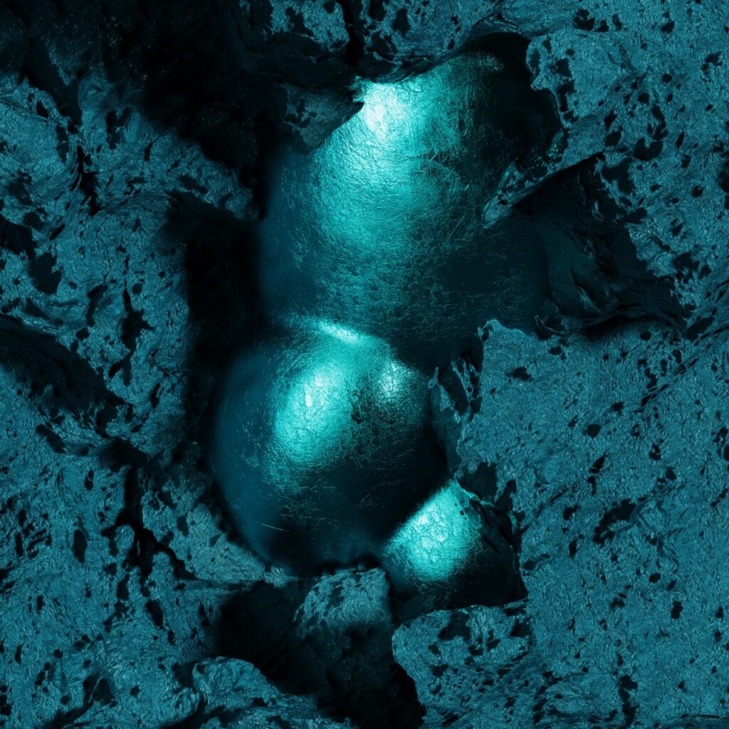
WGSN and Coloro Color of the Year: Transformative Teal
HEX:#2F6364 and RGB:47 99 100
UK-based trend forecasting agency WGSN and their sister company, Coloro, chose a luxe jewel tone called Transformative Teal. They describe this water-inspired shade as a “fluid fusion of dependable blue and aquatic green that reflects the diversity of nature and taps into an Earth- first mindset.” Climate change isn’t going away, so we need to keep advancing ideas around sustainability, which this color encourages. WGSN was not afraid of making a powerful political declaration.
Their data also shows a growing interest in blue/green/teal product searches. It’s a stunning choice for autumn and winter, but if applied as a neutral can work year- round. Painting all four walls of a small room will make a splash, like stepping into the bottom of the ocean. You’ll enjoy the shimmer of its darkened teal glory.
If the intensity overwhelms you, it works as an accent color in the bedroom, the dining room, and in tabletop. In keeping with the sustainability theme, look for products using deadstock fabrics, recycled yarns, or textiles made from discarded food waste.
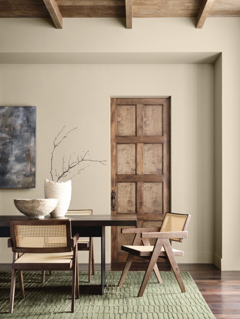
Behr Color of the Year: Hidden Gem
HEX:#596D69 and RGB:89 109 105
Continuing with the green theme, Behr chose a sublime “smokey jade with an air of mystery.” This deep midtone can act as a neutral due to its muted top note that makes it a little less jarring as a main wall color. Kitchens are moving away from all white and minimalist styles, making Hidden Gem a sophisticated choice for cabinetry with brass knobs or a textured tile backsplash for a lush streak of green.
Utilizing this in the bathroom will create a peaceful, spa effect that emphasizes the oceanic nature of the color. Look to the outdoors and bring natural color palettes into the living room for soothing energy. This could include juxtapositing cool and warm materials. Think jade pillows or cozy blankets paired with structured leather or wood furniture.
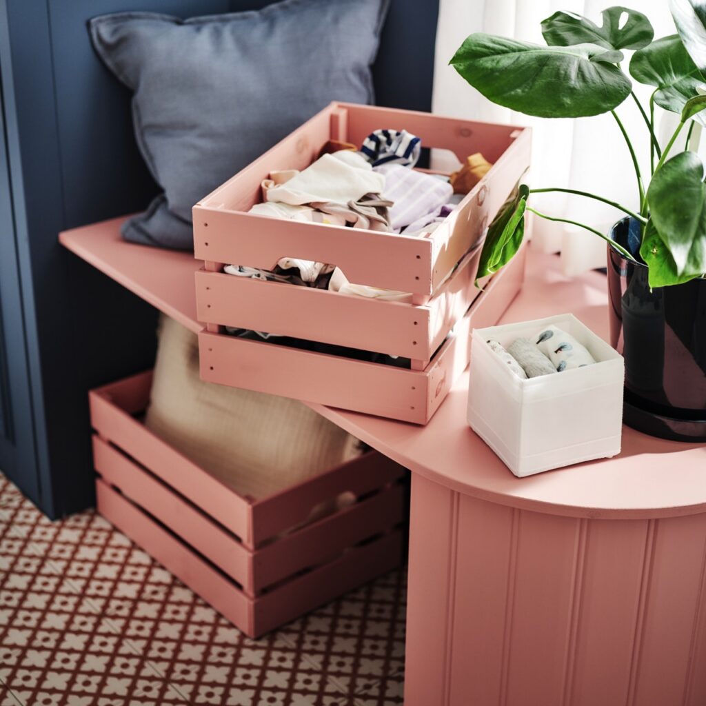
IKEA Color of the Year: Rebel Pink
HEX: FF8DA1 and RGB: 255 141 161
IKEA’s second time doing Color of the Year feels like a renegade choice. However, right now taking delightful risks pays off. Rebel Pink celebrates sweetness, joy, and nostalgia with a single pop of pink. When the world feels too serious and tumultuous, we tend to draw inward. Just as often, though, we look for the exclamation point at the end of a sentence that surprises and excites, which is exactly how we should use this color in the home.
Bring some warmth into the office with a library desk lamp coated in a matte pink to make the room less about work and more about play. That is the key word with this Crayola-like kid color. Experiment! Don’t hold back. In the kitchen, paint a little breakfast nook to create a bubblegum world, or display a set of ceramic mixing bowls for a retro vibe. Of course, this can still be used for anything kid related.
Let’s keep in mind, however, that kids shouldn’t have all the fun. “Think pink!” with pink flowers in pink vases or make a pink edged mirror the focal point for a double take when walking by. Rebel Pink shouts self-expression from the rooftops, as it is meant to “replace white walls with a refreshing energy that feels empowering and modern.” This is the message we need for 2026.
Sherwin Williams and HGTV Home by Sherwin-Williams Color of the Year: Universal Khaki
HEX: #B8A992 and RGB: 184 169 146
Universal Khaki is a well-known neutral with a big footprint in fashion. It pairs beautifully with Benjamin Moore’s Silhouette (below). There are no muddy undertones, making it a worn, but clean khaki to work with in foundational or accent applications. Sherwin-Williams and HGTV Home by Sherwin-Williams united to pull out your tried-and-true khakis from your wardrobe and brush their color onto your walls.
It’s a classic shade that is meant to have a lived-in feel for longevity. It stabilizes a room to make it easy to layer in bold accents for maximal style. It also lends itself toward a natural environment that can be enhanced with calming notes of greens, browns, or autumnal palettes from the outdoors to continue the grounded aesthetic.
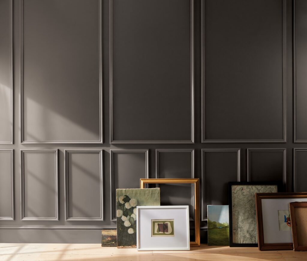
Benjamin Moore Color of the Year: Silhouette
HEX: #57504C and RGB: 87 80 76
The depth of this fashion-forward neutral brings energy to a room without commanding attention, acting more like a sensible friend. Described as “a burnt umber with delicate notes of charcoal” it exudes a warm light filtering through the darker flecks, giving it a bit of extra glimmer. This makes for a timelessly chic alternative to an aggressive black. Silhouette is a refined color and works well in large, monochromatic applications.
Painted on a wall or ceiling with wainscoting, beadboard, or crown molding, it will help to highlight those design accents, making a room feel grand. It also looks tailored, much like a beloved structured blazer, and can easily be transitioned into an office setting.
Story by Abbey Cook
Featured Photo Courtesy of Behr
Subscribe to TABLE Magazine‘s print edition.
