At Milan Design Week 2026, the annual international design fair, color and style forecaster Judith van Vliet found a shift toward interiors that soothe and restore, with hazy transparency, gentler color pairings, and tactile textures creating a refuge from the world.
Our homes are an extension of who we are. Visiting someone’s home can therefore be an intimate experience, as you quite literally step into another person’s world and gain a deeper understanding of who they are. Their use of color or perhaps the deliberate absence of it, the choice between a chaise longue and a sectional sofa, the selection of patterns, textiles, materials, and lighting allreveal something about their personality, values, and lifestyle. Together, these choices reflect not only personal taste but also the needs, rituals, and aspirations that shape everyday life.
Since the pandemic, our lives have been profoundly disrupted, with one crisis seemingly following another. Whether we acknowledge it or not, this ongoing sense of uncertainty has heightened our desire for stability, comfort, and control, especially within the one environment we can shape ourselves: our homes. As a result, we are increasingly drawn to interiors that support emotional and mental wellbeing. Colors, materials, textures, and light are no longer chosen solely for their aesthetic appeal; they are valued for the way they engage our senses, create a sense of refuge, and help calm both body and mind. In an unpredictable world, the home has become a sanctuary designed not just for living, but for restoring balance and peace.
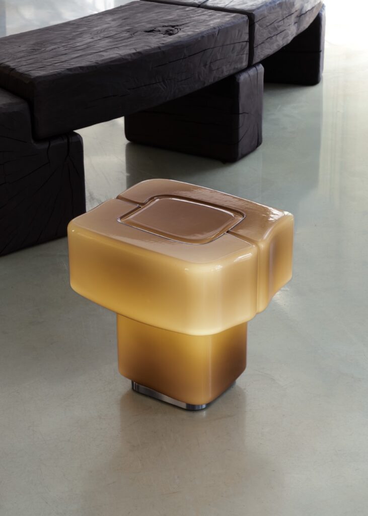
Let There Be Light at Milan Design Week, But Filtered Through Hazy Materials
As our homes continue to evolve into spaces that nurture emotional wellbeing, the materials we surround ourselves with play an increasingly important role in shaping how we feel. One material that stood out prominently during Milan Design Week this year was textured transparency. Designers explored its ability to interact with light, color, and shadow, revealing both its poetic and functional qualities. From luminous and color-rich expressions to playful, sculptural interpretations and richly tactile surfaces, the material demonstrated remarkable versatility and emotional depth. Its growing presence reflects a broader desire for what might be called soft strength: a balance of purity, delicacy, and organic fluidity. It responds perfectly to contemporary living, where interiors seek to foster calm, openness, and connection while maintaining a sense of comfort and privacy. By diffusing light, softening boundaries, and creating subtle sensory experiences, it contributes to spaces that feel both restorative and uplifting.
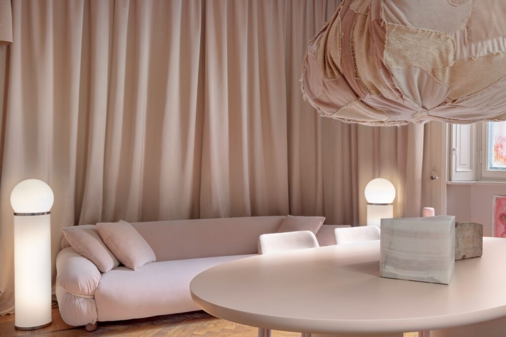
Opposites Attract: Pair Contrasting Textures to Add Depth and Dimension
Materiality emerged as a key focus, with brands exploring rich sensory contrasts through unexpected pairings. Leather met suede, stone was juxtaposed with crystal, ceramic with cement, and soft textiles with smooth resins. These combinations were not merely aesthetic choices; they were carefully orchestrated to engage the senses and create a deeper emotional connection with the space. The interplay between rough and smooth, matte and reflective, soft and hard brought a new dimension to interiors, encouraging touch, curiosity, and comfort. Together, these layered material experiences transformed spaces into environments that feel lived in and inviting, places that don’t simply house us, but embrace us.
Contrast remains an important tool in color design, but its expression is becoming more re fined, softer, and ultimately more human. Rather than relying on bold oppositions, designers are exploring gentler interpretations of complementary colors. Orange and blue, traditionally positioned as opposites on the color wheel, appeared throughout the week in nuanced shades of apricot and baby blue, maintaining their inherent tension while creating a sense of harmony rather than drama. Milan may not have introduced a wealth of entirely new colors this year, but it did reveal fresh ways of combining familiar hues. These palettes felt reassuring and relatable, restoring a sense of belonging through colors we instinctively recognize, yet presented in unexpected contexts, material applications, and spatial compositions.
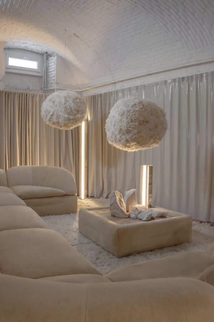
Complementary Colors Go Softer and More Subtle at Milan Design Week
Soft, luminous yellows interacted beautifully with natural light, evoking optimism while stimulating creativity. Gentle blues brought a sense of steadiness and calm, echoing the permanence of the sky and balancing warmer tones. Apricot and muted orange hues acted as social catalysts, fostering warmth, connection, and conversation. Together, these colors formed interiors that felt emotionally intelligent, spaces designed not only to be seen, but to be experienced. They support a growing desire for homes that allow us to reconnect, rebalance, and find comfort in an increasingly complex world.
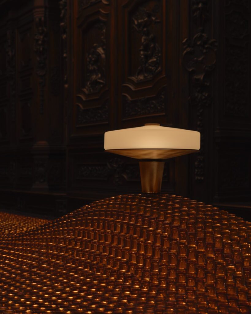
Black and Metal Ground All That Softness
A return of black in combination with aluminum or steel seems out of place in such sensory living, yet, it is explained by its anchoring effect, as well as the color of the material itself, which is honest and allows for a sense of control.
Perhaps the most striking takeaway from Milan was not the emergence of a single defining color, material, or form, but a collective shift in intention. Designers are increasingly creating spaces that respond to our emotional needs as much as our functional ones. In a world that continues to feel uncertain, our interiors are becoming anchors, spaces that help us slow down, reconnect with ourselves and others, and find moments of balance in everyday life. The future of design, it seems, is not about making the boldest statement, but about giving us a sense of belonging.
To check out trends happening right here at home, check out our guide to interior design in Pittsburgh.
Story by Judith van Vliet
Featured Photo by Helenio Barbetta
About the Author
Judith van Vliet, based in Spain, is the founder of The Color Authority and a global expert in color strategy, CMF (Color, Material, Finish) design, and trend forecasting. She helps brands across industries craft compelling and purposeful color narratives. With a background at companies like Kawasaki and Avient, Judith also served as President of the Color Marketing Group and currently hosts The Color Authority podcast. She regularly contributes her expertise in color and materials to MANERA magazine and is member of The Forecast Club. Recognized as one of the leading voices in color intelligence, Judith empowers global brands, including Braun De’Longhi, Cosentino, and Renolit, to use color with clarity, purpose, and vision.
Subscribe to TABLE Magazine’s print edition.