This week from June 29-July 5 brings America’s 250th birthday and we’re ready to celebrate with a string of events to keep you busy the whole week in Pittsburgh. Gather family and friends to embrace your patriotism and most importantly, have a blast (quite literally if you’re headed to a fireworks show). No matter what you dedicate the upcoming holiday week to, take a moment to admire all the we have today while living in the United States, like the right to gather at events like these.
Pittsburgh Events Happening June 29-July 5

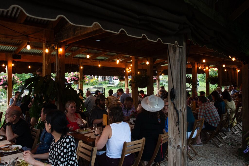
Book Launch: Author Event & Signing with Ed Simon for American Elegy: Reflections on 250 Years of the Dis-United States
June 30, Stay Gold Books
As the Fourth of July approaches, Stay Gold Books invited author Ed Simon in for a talk on the state of America today. Explore sections of his book American Elegy: Reflections on 250 Years of the Dis-United States which paints a picture of the beauty of America, where we went wrong, and hope for getting back on track.
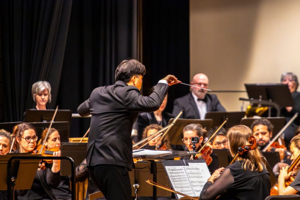
Concert in the Park – Butler County Symphony Orchestra
July 2, Cranberry Community Park
Feeling patriotic? Join your community in the sounds of the Butler County Symphony Orchestra. With a special performance in the park, this group takes you through Americana tunes every age group knows. Plus, you can check out concession stands from Cranberry Noon Rotary Club. Just bring a chair or blanket and your evening is set.
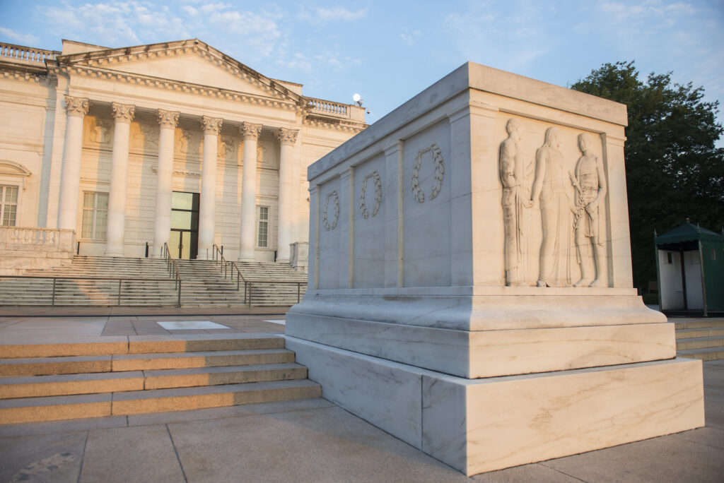
Opening Ceremony for the Traveling Tomb of the Unknown Soldier
July 3, Four Corners Park
The Tomb of the Unknown Soldier sits in Arlington National Cemetery as a reminder, honor, and also reflection of those who lost their lives in battle and were never identified. Rather than make a trip down for the holiday, see a traveling life-size replica right in Four Corners Park. The opening ceremony is a short program to give you a chance to pay your respects.
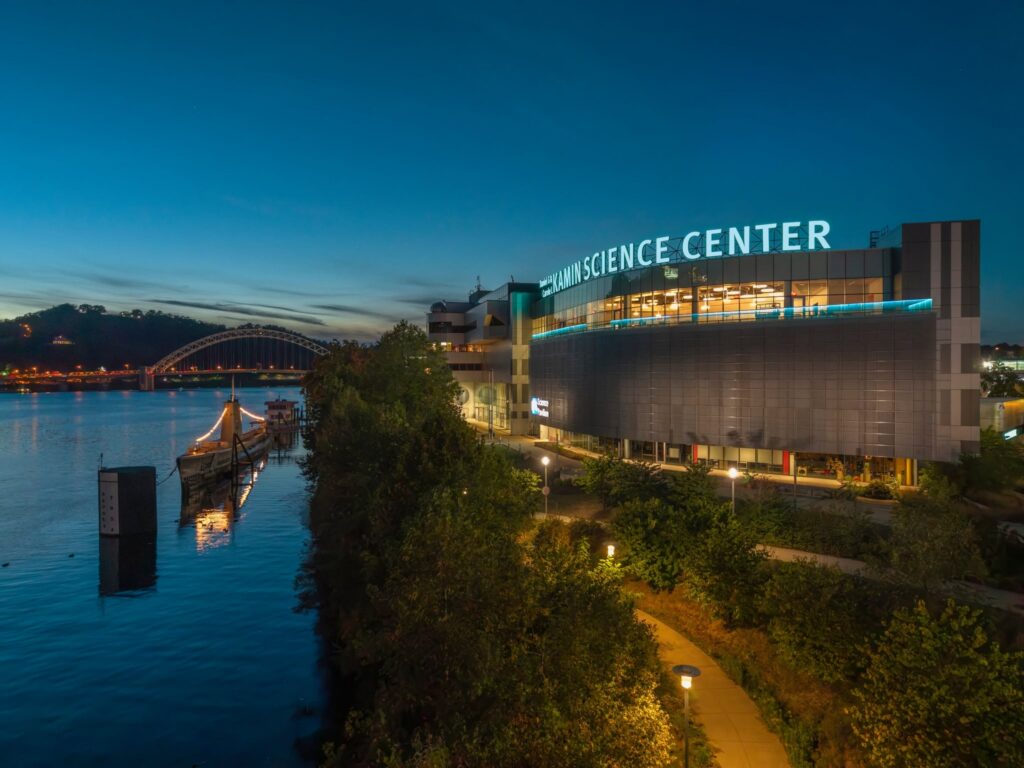
July 4th: Explosive Science!
July 4, Kamin Science Center
Make this Fourth of July one to remember by spending the day at the Kamin Science Center, getting the perfect spot to see the fireworks show in the evening. Throughout the day you can enjoy the exhibits, live entertainment, a cash bar, as well as live theater shows. Then, when the sun sets, head over to the reserved viewing area, ensuring parking and the sights are already taken care of and the fun can continue.

A Voice for Liberty: Americana Sing-a-Long
July 5, Evans City Cemetery
In case the Fourth left you busy with family or work, use July 5 as your chance to embrace your patriotism. As a part of America 250 in Butler, join your neighbors in a sing-a-long of classic anthems and tributes to our country. Not to mention, you can try your hand at patriotic trivia and relax with the rest of your community as you pay tribute to our veterans.
Plus, check out our calendar for other events this week and beyond!
Story by Kylie Thomas
Featured Photo From Forsaken Films
Subscribe to TABLE Magazine‘s print edition.